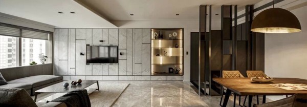
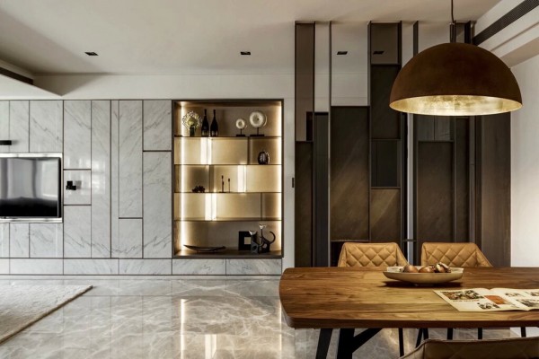
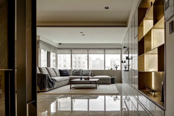
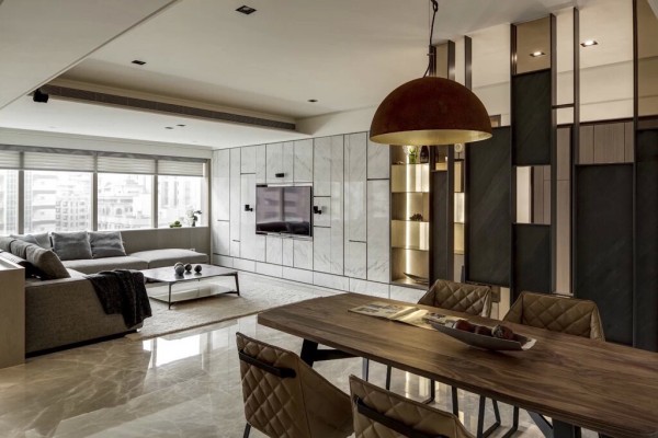
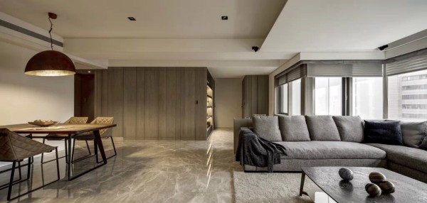
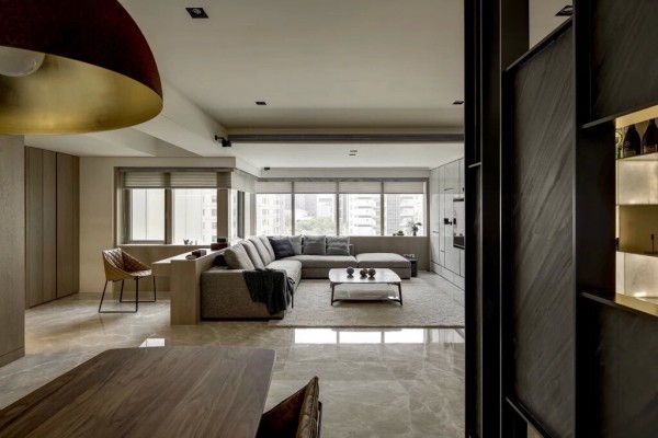
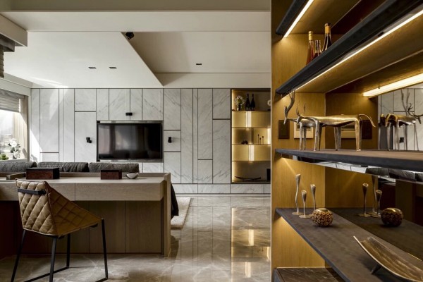
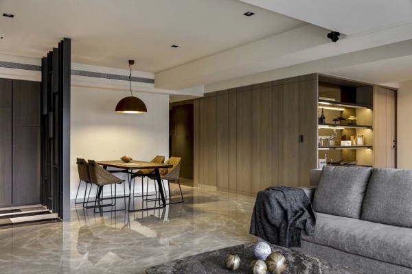
Our first tour takes us into what we’d imagine as a suite fit for the ambitious and creative Peggy. This space, at first glance, may appear more masculine, but upon closer inspection, it’s easy to see why one like Peggy might easily fall in love. Open and bright, this apartment has a feel of length and continuity – there’s infinite possibility as clean lines play with soft curves. What really sold us on this space for Peggy were the luxe quilted details on the dining and living area upholstery, as well as the brushed metallics.
2 |

2 |
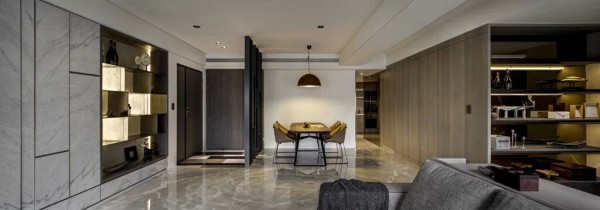
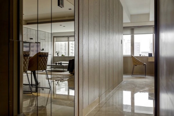
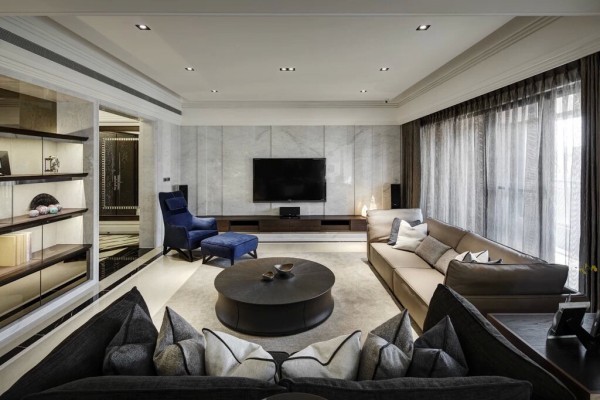
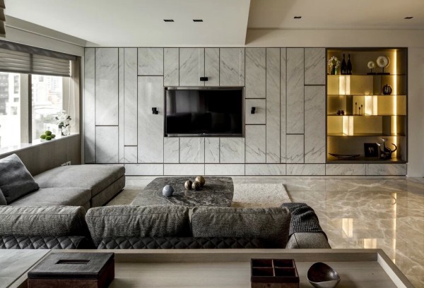
With a combined living and dining area, this space is ideal for entertaining. Luxurious marble along the wall and floor plays with open shelving of rich but natural woods. Like Peggy’s copy ideas, her furnishings would be carefully curated and collected – each considered in detail for quality as well as beauty and function.
3 |

3 |
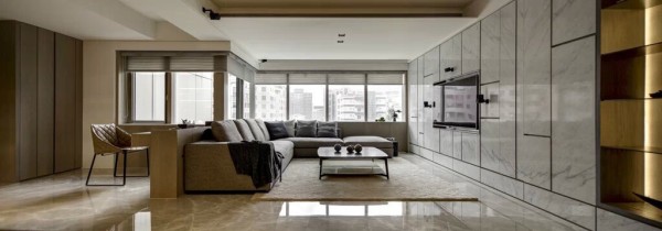
While there isn’t prominent artwork on the walls, the space still feels very cozy and warm. Strategic lighting and the use of ambient light from the windows keeps this space from feeling sleepy. There is, however, a very striking sense of calm.
4 |
5 |
6 |
7 |
8 |
9 |

4 |

5 |

6 |

7 |

8 |

9 |
Everything about the common living areas is straightforward and direct, like Peggy, but still with a sense of grace and softness.
10 |
11 |
12 |

10 |

11 |

12 |
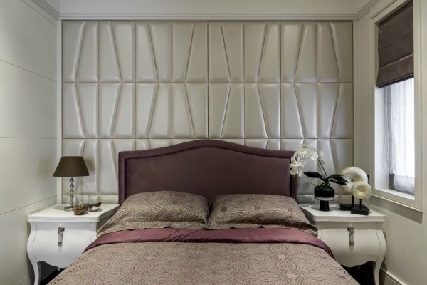
Distinctly feminine, the first bedroom is one we think Peggy would enjoy. Curved end tables sit on both sides of the upholstered bed. No doubt, exquisite textiles in a nice plum shade provide comfort. It’s the textured wall behind the bed that is the real stunner, though.
13 |

13 |
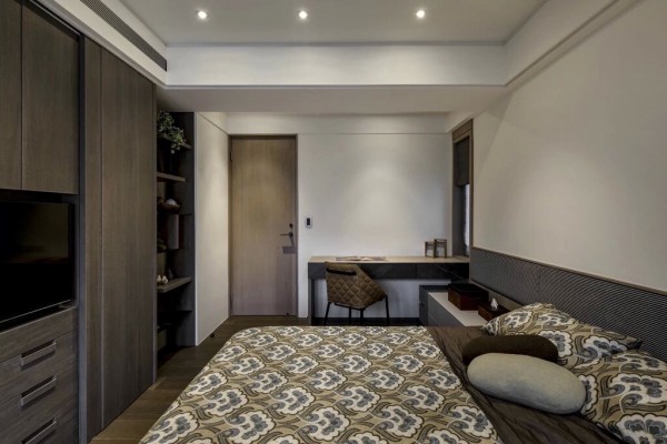
The second bedroom reminds us of Peggy’s desire for travel and exploration, as this room is all about utility. While beautiful and modern, it’s kept to the essentials and looks similar to a luxe hotel suite. Ideal for guests, it offers ample comfort with a media center, comfortable bed, and writing desk.
14 |

14 |
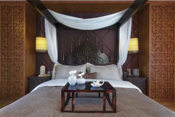
The third bedroom is an unexpected departure from the rest of the house. It is sensual and exotic, with design elements pulled from multiple cultures and influences. It is a true escape and treat – and it captures perfectly Peggy’s own desire for the new and the unexplored. A master suite we know she would adore.
15 |

15 |
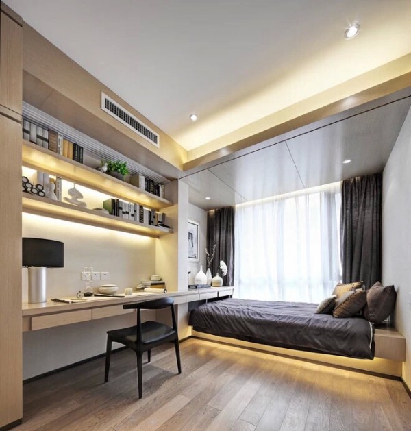
Finally, the fourth bedroom is light, airy, and modern with plenty of clean lines and brightness. We could see Peggy using this space for guests or as her own office or reading nook. Imagine copy drafts across the desk or storyboards laid across the bed. This is where Peggy could let her imagination run wild, but in comfort.
16 |
17 |
18 |

16 |

17 |

18 |
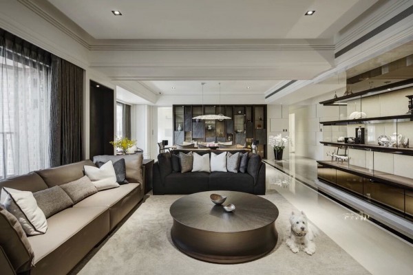
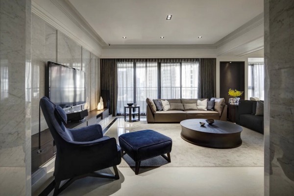
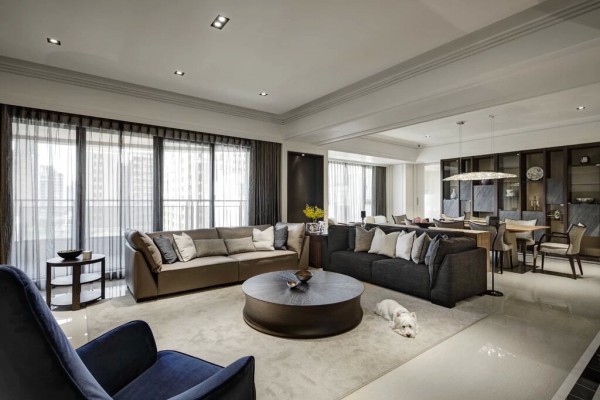
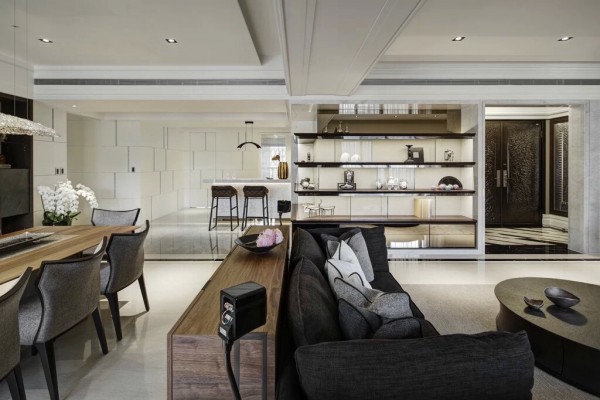
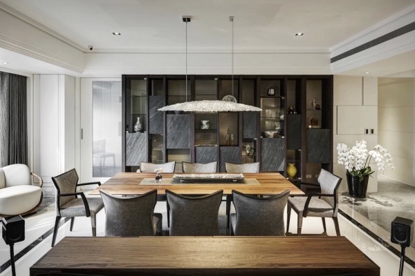
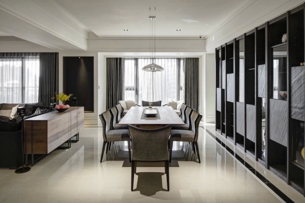
The living area offers ample seating for entertaining and it’s easy to imagine Roger hosting cocktails here before taking a few steps over to the dining area, which showcases a stunning lighting fixture. Along the walls, there’s plenty of space for housing treasured items. We know Roger would likely have a mix of past and present – and most assuredly, a few copies of his memoirs, “Sterling’s Gold”.
19 |

19 |
Light spills into the living and dining area from ample windows. And we all know how much Roger enjoys a good view.
20 |
21 |
22 |

20 |

21 |

22 |
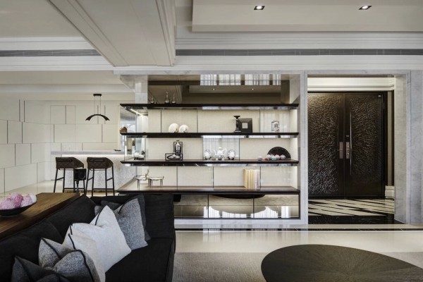
The kitchen area is light and open, with clean white title and a minimalist design. The foyer showcases a stunning set of double doors. Very bold and impressionable. It’s easy to see why Roger might choose an apartment with an open floor plan, sumptuous details, and a bold – but elegant – first impression.
23 |

23 |
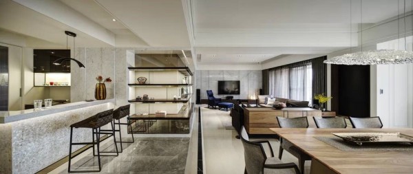
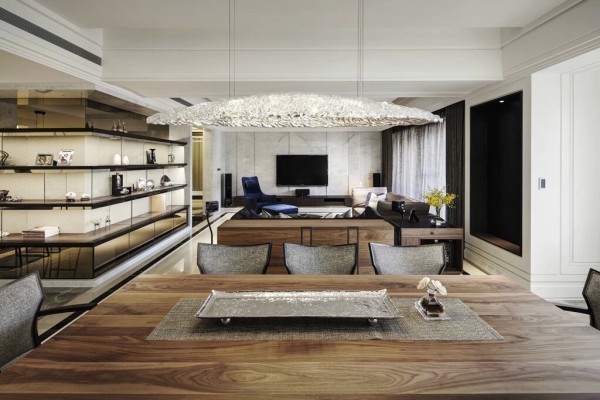
The dining area is open, with a full view of the kitchen and living room. It’s a great space for parties. One could imagine a bar station off the kitchen buffet, records playing, and laughs being shared.
24 |
25 |

24 |

25 |
The dining area is open, with a full view of the kitchen and living room. It’s a great space for parties. One could imagine a bar station off the kitchen buffet, records playing, and laughs being shared.
26 |

26 |
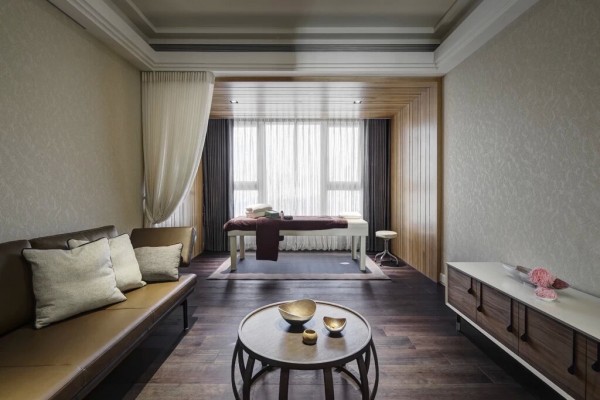
A private room for rest and relaxation is also included in the space, complete with massage table.
27 |

27 |
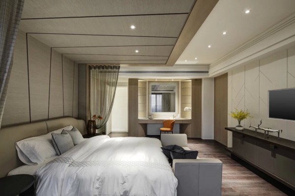
The first bedroom is ideal for guests, showcasing a large and comfortable bed, recessed lighting, large vanity and desk, and media station.
28 |

28 |
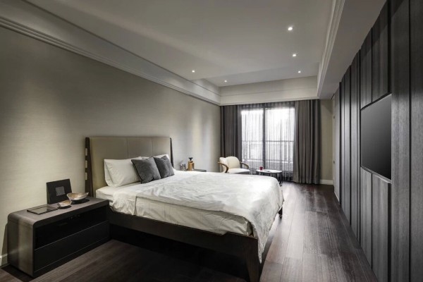
The second bedroom showcases a TV built into a textured wall opposite the bed, modern (but mid-century inspired) furnishings, and high ceilings – perfect for one’s soaring aspirations, like Roger’s.
29 |
30 |
31 |

29 |

30 |

31 |
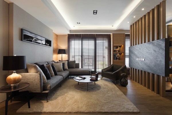
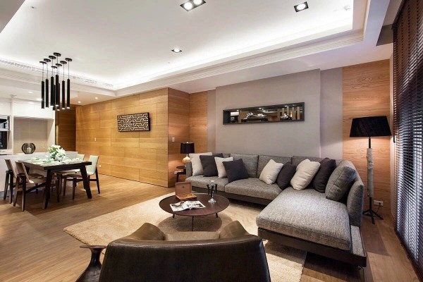
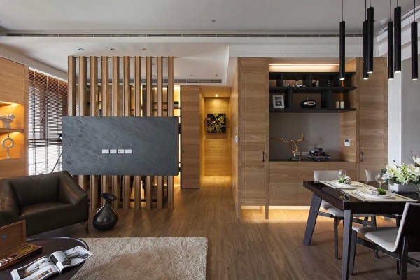
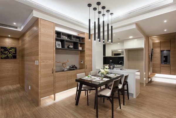
The main living and dining area, while less spacious as the previous two apartments, is cozy and welcoming. One could imagine Don sitting on the sofa, looking over copy drafts. This isn’t a space for parties and entertaining, but for relaxation and reflection. And we all know that Don isn’t the most social of characters. The warm wood along the walls makes the space feel welcoming and serene. Over the dining table, a modern light fixture acts as a focal point in the room. The furnishings take on a mid-century feel with a bit of updating, like the natural wood lamp in the corner and the contemporary dining chairs.
32 |

32 |
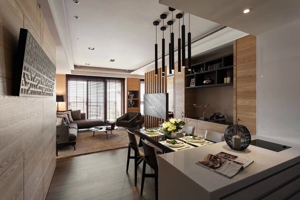
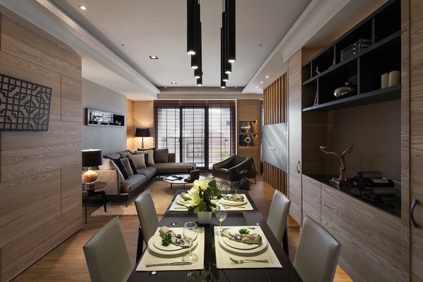
From the kitchen, you can look out into the rest of the space and across to the large bank of windows. The kitchen is efficient and smartly designed. While it’s a smaller dwelling, it never feels cramped. Instead, it feels carefully curated, each decorative item or furnishing placed precisely to ensure the maximum amount of utility. It’s a perfect balance of form and function.
33 |

33 |
The similarly toned woods throughout the walls and floors make the space feel larger and more open. In the hall, a natural wood bench is built into the wall, perfect for resting pairs of shoes, or perhaps Don’s briefcase.
36 |

36 |
An architecturally intriguing wall of wood panels and stone act as a separator between the main living areas and the rest of the house. Storage is ample yet one could imagine that Don would never use all of it. Instead, this place offers a bit of respite for his restlessness. It is welcoming. It feels like home, but also caters to Don’s desire for solitude.
37 |

37 |
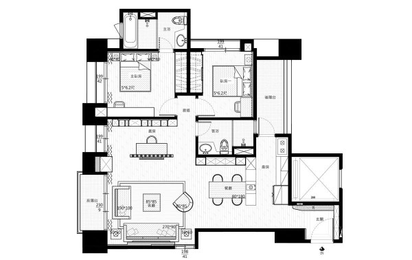
The floor plan clearly shows the smart usage of space between two bedrooms, two bathrooms, and common living space. Yes, we think Don would be a fan of this bachelor pad.


0 Response to "3 Designs by Love Design: A Mad Men Inspired Take"
Post a Comment